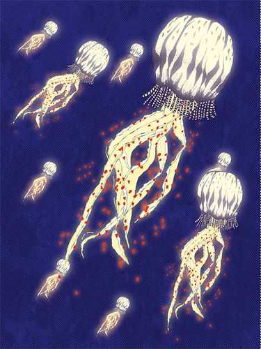
I like this a lot! These colors are nice! I do think it could be improved by making the jellyfish that are further away less high key so that they attract less attention and increase the depth!
I really like the background texture you used, it kind of makes the atmosphere other-worldly. I think it would be great to see your linework a bit more blurred, or maybe add a couple of gradients so that the jellyfish don't look as flat.
I really like how you managed to capture the original look of your linework! I like how you left the glow subtle, it gives a light floaty feel to the piece.
I really like the Jelly fish you drew here, and the way the top of them are glowing. The background texture is also very cool. Did you use the bitmaping thing from photoshop? I would love to see some other types/shapes of jelly fish also.
I reeeeally like the jellyfish design here, and I think the colors work well. I think it would help to add some depth if you faded the ones in the back just slightly, and maybe applied a gradient to the water that goes from black or a deep deep blue at the bottom, and goes to the current color towards the top
i really like you project! very bright and i can see you had fun with the outer glow tool. i would be cool to change up the colors on some to add variety. awesome job!
That's a really great stylization of a jellyfish. I wish you had one or two different shaped ones, so the way that the tentacles are - were a little different from the others! I like the scale difference in each of them as well - the patterns that your'e using are really nice. I could see you adding another pattern element in the negative space here and there, maybe like floating debris, or some kind of movement in the water.
I also think that it would be cool to see one or two of you jellyfish extend past the edge of the page - it would make the composition really interesting by giving the negative space some broken shapes!
I liek he way that you're using the glow effects on the body of the jellyfish, too - It really looks luminescent. I think it could be neat to see what would happen if you added a little bluer tone to the ones in the background so that it looked like they were going back in space -- like there is water between them and the larger one in the foreground? Know what I mean? great pattern elements and textures!

I like this a lot! These colors are nice! I do think it could be improved by making the jellyfish that are further away less high key so that they attract less attention and increase the depth!
ReplyDeleteVery well done with the glowing. The composition is very nice I even like the black and white Jelly fish are awesome.
ReplyDeleteI really like the background texture you used, it kind of makes the atmosphere other-worldly. I think it would be great to see your linework a bit more blurred, or maybe add a couple of gradients so that the jellyfish don't look as flat.
ReplyDeleteI really like how you managed to capture the original look of your linework! I like how you left the glow subtle, it gives a light floaty feel to the piece.
ReplyDeleteI really like the Jelly fish you drew here, and the way the top of them are glowing. The background texture is also very cool. Did you use the bitmaping thing from photoshop? I would love to see some other types/shapes of jelly fish also.
ReplyDeleteI reeeeally like the jellyfish design here, and I think the colors work well. I think it would help to add some depth if you faded the ones in the back just slightly, and maybe applied a gradient to the water that goes from black or a deep deep blue at the bottom, and goes to the current color towards the top
ReplyDelete:O <- This is the face I just made. I reaaaaally like these jelly fish! Great execution on materials in illustrator.
ReplyDeleteI really like this jellyfish, you should make it into a pattern it would be super great!
ReplyDeletei really like you project! very bright and i can see you had fun with the outer glow tool. i would be cool to change up the colors on some to add variety. awesome job!
ReplyDeleteThat's a really great stylization of a jellyfish. I wish you had one or two different shaped ones, so the way that the tentacles are - were a little different from the others! I like the scale difference in each of them as well - the patterns that your'e using are really nice. I could see you adding another pattern element in the negative space here and there, maybe like floating debris, or some kind of movement in the water.
ReplyDeleteI also think that it would be cool to see one or two of you jellyfish extend past the edge of the page - it would make the composition really interesting by giving the negative space some broken shapes!
I liek he way that you're using the glow effects on the body of the jellyfish, too - It really looks luminescent. I think it could be neat to see what would happen if you added a little bluer tone to the ones in the background so that it looked like they were going back in space -- like there is water between them and the larger one in the foreground? Know what I mean? great pattern elements and textures!