hahahahaha, it is so funny! I really like that you used the same actor for the icons. I think maybe you could change the size of some icons a little. Maybe the green one which the guys is in a shoe could be a little smaller?
I love the motion in the first pattern! I think the colors you used are all very close in tone, you could maybe use a couple more light colors to give it more depth. I really like the simplicity of your secondary patterns, but I think I would like you to make your icons smaller and more numerous.
Great job on the character designs they feel very animated (i wonder why). the color scheme goes very well together. The icon that stands out the most is the balloon. I would try a different color since yellow is the brightest color you use and the balloon is the largest shape.
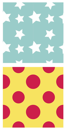
I think the the main and secondary patterns go together very well together it would be interesting to see even more star variations in the one pattern such as a star within a star to add even more patterns without have to create another shape but reuse the ones you already have. Awesome job you already look like you've been using illustrator for a long time.
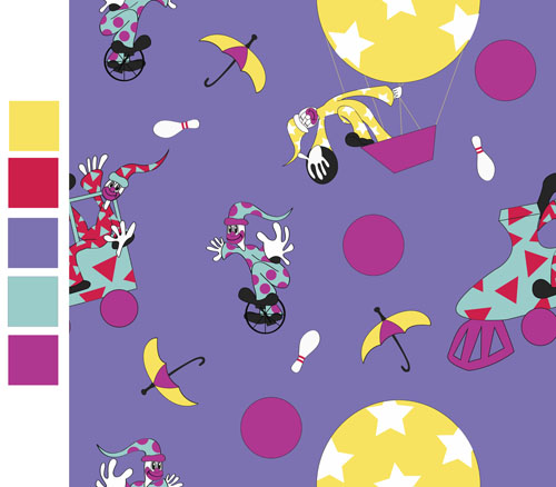
I love the color palette on this! Is it supposed to be summer? Or - birthday? I forget what you said in class! It's not super clear, but I think it reads more birthday - for kids! I really like your secondary icons and how you've used them - they're nice shapes and bring a little bit of color into some of the purple areas! I also liek that you have a couple sub-patterns in some of your icons - like the train and the balloon. Those work out well as coordinate patterns - good job using those!
Right now it's pretty easy to see where your repeat is, mostly because you have a big yellow balloon that is hard to hide, but if you were able to either offset that yellow guy with some other large yellow round thing somewhere else in the pattern, you might not focus on it as much. Or, you could expand your repeat by two and then move some of the balloon guys around so you can fit more of them in the pattern. That would let you use the triangle rule with them, and they wouldn't be so obvious! Let me know if you know what I mean! I can definitely help you in class - jsut let me know and I'll come over and show you! I love the action of the clowns. They look really rubbery and energetic!

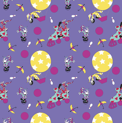
hahahahaha, it is so funny!
ReplyDeleteI really like that you used the same actor for the icons.
I think maybe you could change the size of some icons a little.
Maybe the green one which the guys is in a shoe could be a little smaller?
I really liked the fact that you used the pattern in the balloon in the other pattern you did.
ReplyDeleteThe balloon does really stick out a lot though. maybe if you made them smaller or put the color in another area also it would work better.
Im guessing this is for BIRTHDAY so way to go!
I love the motion in the first pattern! I think the colors you used are all very close in tone, you could maybe use a couple more light colors to give it more depth. I really like the simplicity of your secondary patterns, but I think I would like you to make your icons smaller and more numerous.
ReplyDeleteGreat job on the character designs they feel very animated (i wonder why). the color scheme goes very well together. The icon that stands out the most is the balloon. I would try a different color since yellow is the brightest color you use and the balloon is the largest shape.
ReplyDeleteI think the the main and secondary patterns go together very well together it would be interesting to see even more star variations in the one pattern such as a star within a star to add even more patterns without have to create another shape but reuse the ones you already have.
Awesome job you already look like you've been using illustrator for a long time.
I love the color palette on this! Is it supposed to be summer? Or - birthday? I forget what you said in class! It's not super clear, but I think it reads more birthday - for kids! I really like your secondary icons and how you've used them - they're nice shapes and bring a little bit of color into some of the purple areas! I also liek that you have a couple sub-patterns in some of your icons - like the train and the balloon. Those work out well as coordinate patterns - good job using those!
ReplyDeleteRight now it's pretty easy to see where your repeat is, mostly because you have a big yellow balloon that is hard to hide, but if you were able to either offset that yellow guy with some other large yellow round thing somewhere else in the pattern, you might not focus on it as much. Or, you could expand your repeat by two and then move some of the balloon guys around so you can fit more of them in the pattern. That would let you use the triangle rule with them, and they wouldn't be so obvious! Let me know if you know what I mean! I can definitely help you in class - jsut let me know and I'll come over and show you! I love the action of the clowns. They look really rubbery and energetic!