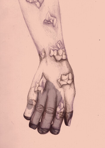
great process shots, i love where you ended up in this work in comparison to where you began. adding bits of color here and there to accent the swell of hives is a great decision. you're textures are nice as well
I really like where you're adding in that deep purple to the tips of the fingers, though I'd love to see more of that dark purple added in to the rest of the hand/arm somewhere- perhaps even just softening the cut-off to the lighter textures, like you've done with the reds? I'm a bit confused as to whether the spots on the hands are bubbling outwards, or if they're areas revealed under the skin.
Looks like the black finger tips will fall off. Really like the color scheme and level of detail put into it. This fits the theme really accurately and the composition is well laid out. I like what you did in the first image where you have some of the color cut away. I wonder if you could add more of that throughout the final image to give it more of a rotting feel. Even thought it has holes in it I get the feeling the skin is smooth and alive. Great work.
This is so creepy IT MAKES ME SICK EWWW! I like the weird colors of the things in the hand! it's a hard to tell if the things are inside the hand or out though~
Great coloring and shading. I like that the subtle hatching in the skin is neutralized but still intact. I think you should figure out a different background though. The texture you used is okay, but it feels a little too light and generic. I think you should come up with something that better reflects the dirty/rotting feel, or puts the hand in some sort of context.
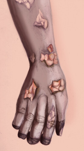
I really like the way yo'uve handled the color of the linework in this piece. the nice purpley color is great along with the rotting look of this arm! I also think that the way that you're using the hits of red makes those areas look raw and infected. Nice job. I could see you adding a little bit of crackley texture to some areas of the skin around the sores maybe -- like -- to simulate it peeling away -or - if it seemed like the skin was infected and flossy there or something. It definitely gets the mood across and I love how the arm has just a little more color and saturation than the rest of the whole piece. It could also be really cool to see what would happen if you went on top of this with some white highlights - with pencil (like , the same way you used your colored linework for the initial drawing-- and maybe that could look like gross, raw skin). Nice job!

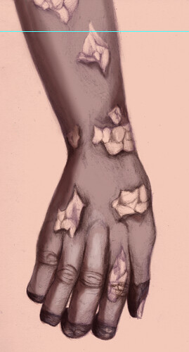
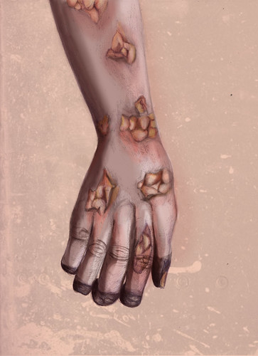
I LOVE the colors and textures. The hand definitely looks diseased and fits the theme perfectly!
ReplyDeletegreat process shots, i love where you ended up in this work in comparison to where you began. adding bits of color here and there to accent the swell of hives is a great decision. you're textures are nice as well
ReplyDeletereally like the texture you put into the background
ReplyDeleteI really like where you're adding in that deep purple to the tips of the fingers, though I'd love to see more of that dark purple added in to the rest of the hand/arm somewhere- perhaps even just softening the cut-off to the lighter textures, like you've done with the reds? I'm a bit confused as to whether the spots on the hands are bubbling outwards, or if they're areas revealed under the skin.
ReplyDeleteWhoaa, That makes me not want to eat(Which is good since this is a project on the topic of a plague) haha, Muy bueno Rachel.
ReplyDeleteLooks like the black finger tips will fall off. Really like the color scheme and level of detail put into it. This fits the theme really accurately and the composition is well laid out. I like what you did in the first image where you have some of the color cut away. I wonder if you could add more of that throughout the final image to give it more of a rotting feel. Even thought it has holes in it I get the feeling the skin is smooth and alive.
ReplyDeleteGreat work.
This is so creepy IT MAKES ME SICK EWWW! I like the weird colors of the things in the hand! it's a hard to tell if the things are inside the hand or out though~
ReplyDeleteGreat coloring and shading. I like that the subtle hatching in the skin is neutralized but still intact. I think you should figure out a different background though. The texture you used is okay, but it feels a little too light and generic. I think you should come up with something that better reflects the dirty/rotting feel, or puts the hand in some sort of context.
ReplyDeleteI really like the way yo'uve handled the color of the linework in this piece. the nice purpley color is great along with the rotting look of this arm! I also think that the way that you're using the hits of red makes those areas look raw and infected. Nice job. I could see you adding a little bit of crackley texture to some areas of the skin around the sores maybe -- like -- to simulate it peeling away -or - if it seemed like the skin was infected and flossy there or something. It definitely gets the mood across and I love how the arm has just a little more color and saturation than the rest of the whole piece. It could also be really cool to see what would happen if you went on top of this with some white highlights - with pencil (like , the same way you used your colored linework for the initial drawing-- and maybe that could look like gross, raw skin). Nice job!
ReplyDelete