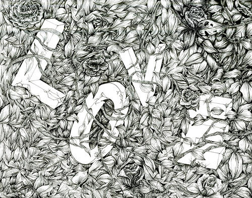
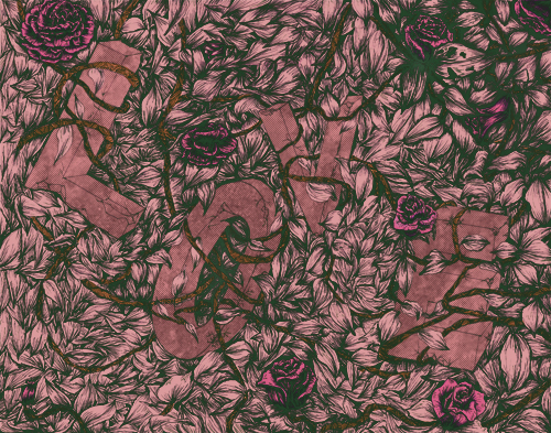
THis is super gorgeous! I love the pattern of the leaves and roses and vines and everything and your colors are super great. I think maybe you could push the contrast a bit more?
Also, I am not really certain how this relates to plague, but I do really enjoy it as an image!
the line work is absolutely beautiful. everything is so delicate... I wish you posted a detail shot to see it up close! also, I feel that your dark color could be a tad darker, just to add a bit more depth.
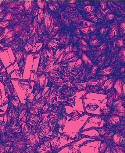
Holy wow, awesome rendering! The texture you used on this is works really well. The shadows can be pushed a bit more on the letters and your linework would look great with a little bit more dark variations. :)
Oh my I love the green black line work. The colors are really the best. There is a quiet burning in this which is really nice. I think it's because of all the nice color shifts.
Season, this is one of the coolest things I"ve seen you do - not only is it a great drawing, but the concept is fantastic. You should definitely keep going with this -- maybe you could make a series of work with different textures and different words. I like how you're using the linework on top of a hot color. It makes the negative spaces between your linework stand out and seem positive.
I think it could be cool to see how you might make this look like one of those screen-prints where they put multiple colors on the screen when the pull it -- and the linework could have almost a rainbow/spectrum effect on top of the color. Do you know what I mean? Like when they do old band posters? I could see you also playing a little bit with some of the variation in the letter colors as well - maybe just a little difference in these would help them stand out a little more - like if they were lighter than the pink in the background?

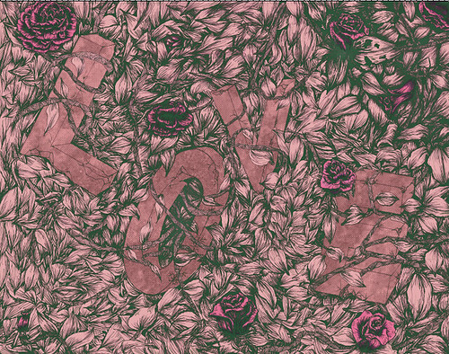
THis is super gorgeous! I love the pattern of the leaves and roses and vines and everything and your colors are super great. I think maybe you could push the contrast a bit more?
ReplyDeleteAlso, I am not really certain how this relates to plague, but I do really enjoy it as an image!
Woah...that's some pretty epic texture...
ReplyDeleteI agree with Maya. I'm not seeing the plague connection, but I do really like this image.
the line work is absolutely beautiful. everything is so delicate... I wish you posted a detail shot to see it up close! also, I feel that your dark color could be a tad darker, just to add a bit more depth.
ReplyDeleteI like it when you get super detailed in your illustrations. The slight shift in colors are nice, i'm happy you experimented with a few.
ReplyDeleteHoly wow, awesome rendering! The texture you used on this is works really well. The shadows can be pushed a bit more on the letters and your linework would look great with a little bit more dark variations. :)
ReplyDeleteOh my I love the green black line work. The colors are really the best. There is a quiet burning in this which is really nice. I think it's because of all the nice color shifts.
ReplyDeleteSeason, this is one of the coolest things I"ve seen you do - not only is it a great drawing, but the concept is fantastic. You should definitely keep going with this -- maybe you could make a series of work with different textures and different words. I like how you're using the linework on top of a hot color. It makes the negative spaces between your linework stand out and seem positive.
ReplyDeleteI think it could be cool to see how you might make this look like one of those screen-prints where they put multiple colors on the screen when the pull it -- and the linework could have almost a rainbow/spectrum effect on top of the color. Do you know what I mean? Like when they do old band posters? I could see you also playing a little bit with some of the variation in the letter colors as well - maybe just a little difference in these would help them stand out a little more - like if they were lighter than the pink in the background?
This is super beautiful. Nice job.