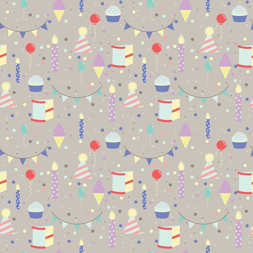
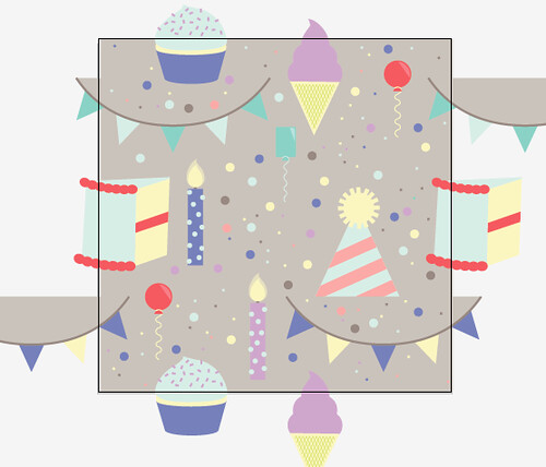
Seeing the process of this I really like how it turned out. I think your BG grey works really well. It feels a bit warmer than the last one. And your icons are so cute!
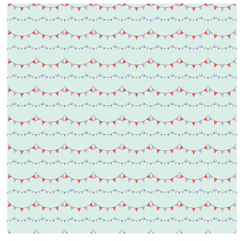
I like the secondary pattern with the flags. I'd kind of like to see them spaced a little bit wider vertically. But I still think it looks good :).
i really love this birthday theme you got here! i love both patterns! the only thing i would suggest is making the background color for the main pattern a different color, maybe one of the ones you already have something. something other than grey. but other than that i like it! cool icons!
I like the theme and the illustrations. The balance is great, but it would be nice to see these shapes "loosen up" a bit. Maybe have some at a different rotation so it's more "party-like". The bunting flag is cute, but so static. More movement is all I suggest.
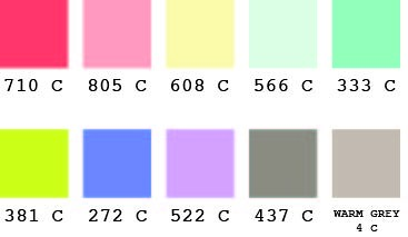
I really love these! I love the concept and the color pallet, though I do worry that because it is so muted it might not be festive enough? I personally enjoy that but I'm not certain about consumers!
OMG, I love both of them. the color choosing and the design are great. the second surprised, because there are only two icons in the pattern, but it is still super cool and interesting
Your icon choice is phenomenal, and I think you spaced your pattern really well. The only thing that I'm on the fence about is the background color in your first pattern. I think maybe the gray tone is just too close to the tones of everything else, so the depth is lost. Plus it kind of makes it a calmer looking pattern as opposed to an exciting party pattern like your icons indicate.
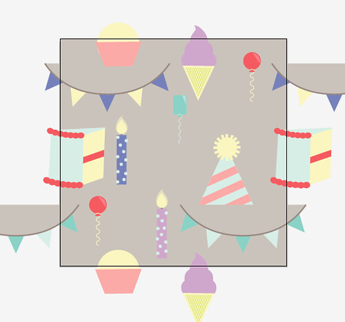
THIS IS AMAZING! These look totally professional - the colors, the spacing, and the combination of scale between both. I love the topic, it is super fun and fitting with the way you've rendered the icons. I could totally see this on invitations, scrapbooking paper, and party supplies. I like how you are offsetting the icons using the triangle method - if I were to add anything, i think you add a couple more red bits -- I think it would be cool to see some red under the tall cake - I'll point out where I mean ! I think the purple might also be able to be bumped up a tiny bit so it stands out from the bkgrd a little more, just a little!
I like how linear the coordinate is as well - I think it helps a lot to have one that is a toss, and one that is more stripey. You did a great job on both of these. Really nice.

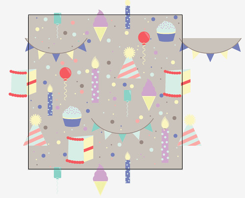
Seeing the process of this I really like how it turned out. I think your BG grey works really well. It feels a bit warmer than the last one. And your icons are so cute!
ReplyDeleteI like the secondary pattern with the flags. I'd kind of like to see them spaced a little bit wider vertically. But I still think it looks good :).
Clear theme here for sure! Spacing looks great
i really love this birthday theme you got here! i love both patterns! the only thing i would suggest is making the background color for the main pattern a different color, maybe one of the ones you already have something. something other than grey. but other than that i like it! cool icons!
ReplyDeleteI like the theme and the illustrations. The balance is great, but it would be nice to see these shapes "loosen up" a bit. Maybe have some at a different rotation so it's more "party-like". The bunting flag is cute, but so static. More movement is all I suggest.
ReplyDeleteI really love these! I love the concept and the color pallet, though I do worry that because it is so muted it might not be festive enough? I personally enjoy that but I'm not certain about consumers!
ReplyDeleteOMG, I love both of them. the color choosing and the design are great. the second surprised, because there are only two icons in the pattern, but it is still super cool and interesting
ReplyDeleteYour icon choice is phenomenal, and I think you spaced your pattern really well. The only thing that I'm on the fence about is the background color in your first pattern. I think maybe the gray tone is just too close to the tones of everything else, so the depth is lost. Plus it kind of makes it a calmer looking pattern as opposed to an exciting party pattern like your icons indicate.
ReplyDeleteTHIS IS AMAZING! These look totally professional - the colors, the spacing, and the combination of scale between both. I love the topic, it is super fun and fitting with the way you've rendered the icons. I could totally see this on invitations, scrapbooking paper, and party supplies. I like how you are offsetting the icons using the triangle method - if I were to add anything, i think you add a couple more red bits -- I think it would be cool to see some red under the tall cake - I'll point out where I mean ! I think the purple might also be able to be bumped up a tiny bit so it stands out from the bkgrd a little more, just a little!
ReplyDeleteI like how linear the coordinate is as well - I think it helps a lot to have one that is a toss, and one that is more stripey. You did a great job on both of these. Really nice.