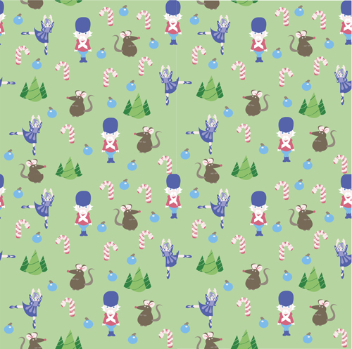
These patterns were inspired by the iconic "Nutcracker" ballet, which is especially popular around Christmas time. I thought this theme would be appropriate.
My main one:
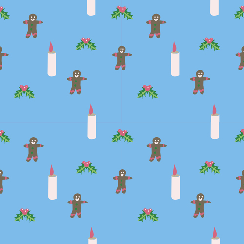
My complimentary one:
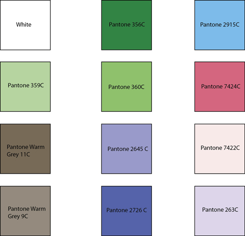
This was the color palette I used for both patterns:
My workspace:


This is an interesting theme. The size variations do not have enough contrast for me, I feel like there could be a wider variety of sizes. Big-small.
ReplyDeleteI think the layout of your main patter looks great, but you may want to have the figures a liiiiittle bit more spaced out. There's so much for the eye to take in, I think it would be really effective to just take a couple of those pieces out. I love the icons you used in your second pattern, but I think having something small in the background would give it a bit more depth.
ReplyDeleteI like the openness of the patterns. I could see you making the scale of the nutcracker one about twice as big so you get more credit for your icons! I think you'er doing a good job working with the triangle rule - where you space out your icons in a triangular fashion for the most part! The only place I look at is the ballet girl in the green pattern. she is making a little bit of a blue ballet line down the pattern. See what I mean? I think if you could move her to hte side, it would help a lot! Find a way to offset her so she is further over! I think you've done a great job with the other icons, though - the nutrcracker and the mouse especially.
ReplyDeleteI could see you trying another color for the lighter tree, maybe? It seems to be a tiny bit close to the bkgrd pattern!
I also like the simplicity of the second pattern! I think the blue is a great contrasting color to put in the background and it helps to showcase the icons on top. Great job with creating interesting icons that go together really well! I think it would be cool to see what you could do with a fun candycane stripe in red or something to complement these!