I like the top pattern a lot. However, on the bottom, I'd like to see a large swatch, and maybe make the leaves smaller. It kind of takes a minute for your mind to recognize that they are in fact leaves. The color palette is really nice!
i love it! you definitely see that this is a fall pattern. i love the color palette and the only thing i would suggest is that in your main pattern i could see more icons. over all good job!
I could see this on all of the presents during christmas! Or on the table for Christmas dinner. The fall leaves one is interesting, but hard to dissect as a pattern, perhaps it is just the way it is presented. Space between the top pattern and the bottom and separation from the swatches would be helpful in the viewing of this piece.
Your icons and pattern-tossing look lovely (mostly on the top piece). The colors feel nicely picked as well~ I'm not quite sure I like how much orange is in the coordinate pattern, perhaps replacing it with the green, or even replacing the cream color with the green? I'd have to see how it looks to know for sure. I'm trying to think of something you could do to tone down the coordinate pattern, perhaps using some of the simpler leaves you have in the first pattern instead of the.... feathery? ish? leaves you have now. Perhaps try organizing them in a different way as well? I really like the main pattern though- nice work!
I really enjoy these a lot! I can't decide if these should be autumn or Christmas, though - when shown together they could sort of go either way and aren't quite decisively either. But I really love your colors - very nice. I could really see this printed on one of those earthy, recycled papers that seem pretty on trend right now.
Great spacing and texture achieved with the cedar leaves! I also like the way they are rotated and mixed. Looks very flowy, like falling leaves.
Coloring the bottom leaves red and beige on an orange background (instead of red/orange on beige, for example), along with the way the leaves fit closely together, makes it not so easy to tell which shapes are negative and positive. This is good in my opinion because in some places the negative shapes almost look positive, and vise versa.
I love the mini pattern so much. you've done an awesome job with the spacing and introducing little pops of color with the small leaves. This pattern is awesome. It looks very professional. I also like where you're going with the bigger leaf pattern, but I wonder if there is another color you could consider introducing in place of the white leaf? For some reason it stands out as a negative space to me? I'm not sure if it's just because there is a midtone ground? But it could be cool to see what happens if it was brown, maybe? I also like the variation in scale between the two of them.
Did you use a rectangle for the repeat on both? Is the repeat of your large leaf really small - it would be great to see a larger swatch of that one to show how it really repeats, it looks like it's cut off?

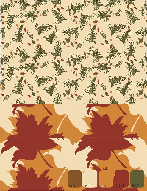
I like the top pattern a lot. However, on the bottom, I'd like to see a large swatch, and maybe make the leaves smaller. It kind of takes a minute for your mind to recognize that they are in fact leaves. The color palette is really nice!
ReplyDeletei love it! you definitely see that this is a fall pattern. i love the color palette and the only thing i would suggest is that in your main pattern i could see more icons.
ReplyDeleteover all good job!
I could see this on all of the presents during christmas! Or on the table for Christmas dinner. The fall leaves one is interesting, but hard to dissect as a pattern, perhaps it is just the way it is presented. Space between the top pattern and the bottom and separation from the swatches would be helpful in the viewing of this piece.
ReplyDeleteYour icons and pattern-tossing look lovely (mostly on the top piece). The colors feel nicely picked as well~ I'm not quite sure I like how much orange is in the coordinate pattern, perhaps replacing it with the green, or even replacing the cream color with the green? I'd have to see how it looks to know for sure. I'm trying to think of something you could do to tone down the coordinate pattern, perhaps using some of the simpler leaves you have in the first pattern instead of the.... feathery? ish? leaves you have now. Perhaps try organizing them in a different way as well? I really like the main pattern though- nice work!
ReplyDeleteI really enjoy these a lot! I can't decide if these should be autumn or Christmas, though - when shown together they could sort of go either way and aren't quite decisively either. But I really love your colors - very nice. I could really see this printed on one of those earthy, recycled papers that seem pretty on trend right now.
ReplyDeleteGreat spacing and texture achieved with the cedar leaves! I also like the way they are rotated and mixed. Looks very flowy, like falling leaves.
ReplyDeleteColoring the bottom leaves red and beige on an orange background (instead of red/orange on beige, for example), along with the way the leaves fit closely together, makes it not so easy to tell which shapes are negative and positive. This is good in my opinion because in some places the negative shapes almost look positive, and vise versa.
I love the mini pattern so much. you've done an awesome job with the spacing and introducing little pops of color with the small leaves. This pattern is awesome. It looks very professional. I also like where you're going with the bigger leaf pattern, but I wonder if there is another color you could consider introducing in place of the white leaf? For some reason it stands out as a negative space to me? I'm not sure if it's just because there is a midtone ground? But it could be cool to see what happens if it was brown, maybe? I also like the variation in scale between the two of them.
ReplyDeleteDid you use a rectangle for the repeat on both? Is the repeat of your large leaf really small - it would be great to see a larger swatch of that one to show how it really repeats, it looks like it's cut off?
Great job!