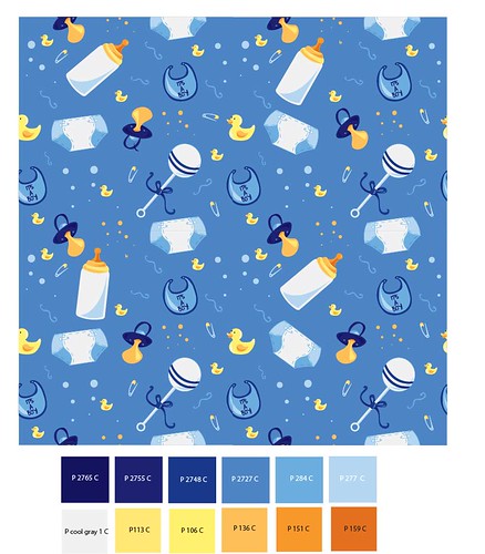
I think the color choice for your pattern looks /GREAT/ I love the main pattern and I think you spaced things very well.
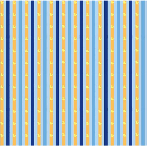
I think the secondary pattern could be toned down a lot though. The orange lines make the pattern distracting for me and very linear with the dark blue lines. I think if you soften the dark blue color choice it would appear much calmer. Maybe try your grey pantone?
Very nice job with the top pattern. it looks well balanced and good color choices. The spacing looks good too. The second looks good too. I like the little ducks.
Nice color palette very playful and soft. The coordinate pattern seems a bit intense you could probably switch the dark blue with a softer color. Great icons they flow really well.
This is beyond adorable. Lovely job on the icons, and the colors as well! Nice variation between large and small icons, and spacing too~ I like the subtle shifts you've given the icons so they don't line up exactly. (tilted a bit) I could definitely see your secondary pattern as a wallpaper in a nursery.
If I had a child, I would wrap them in your design...(When it is on clothes of course!) hahah This makes me think of children as a very positive thing, your pattern evokes feeling! Good job chica, Bueno trabajo.
You did a really great job on this. Nice selection of icons - the way you'r using illustrator looks really nice and easy for you! You really have the hang of it! I love that you have varying scales of icons as well, the mini dots, pins and ducks help a lot to move the color around and fill in the space. I think your color palette is nice as well. It could be cool to see what this would look like on a light blue ground, too! The coordinate is nice, too! I could see you doing this at a small scale as well! It's a really nice contrast being a linear pattern.
if you were to change anything, it could be cool to see how you could break up some of the bottle/diaper clusters a little bit more? Is there any way to move them apart a little? If so, I think it would be cool to see one of the large white objects (like the diaper) moving down a little into the space where all the tiny icons are! Otherwise, it looks fantastic! Great job and really nice presentation!

I think the color choice for your pattern looks /GREAT/
ReplyDeleteI love the main pattern and I think you spaced things very well.
I think the secondary pattern could be toned down a lot though. The orange lines make the pattern distracting for me and very linear with the dark blue lines. I think if you soften the dark blue color choice it would appear much calmer. Maybe try your grey pantone?
Other than that I really like your icons. Nice!
This is absolutely adorable! The only thing I would do is maybe tone down the yellow on the coordinate. It's very loud (maybe change it to a white?).
ReplyDeleteVery nice job with the top pattern. it looks well balanced and good color choices. The spacing looks good too.
ReplyDeleteThe second looks good too. I like the little ducks.
Nice color palette very playful and soft. The coordinate pattern seems a bit intense you could probably switch the dark blue with a softer color. Great icons they flow really well.
ReplyDeleteGreat job.
This is beyond adorable. Lovely job on the icons, and the colors as well! Nice variation between large and small icons, and spacing too~ I like the subtle shifts you've given the icons so they don't line up exactly. (tilted a bit) I could definitely see your secondary pattern as a wallpaper in a nursery.
ReplyDeletethe deign of icons are really funny and cute, and the colors using really nice, too.
ReplyDeleteAnd I really like that the same icons have different sizes
If I had a child, I would wrap them in your design...(When it is on clothes of course!) hahah This makes me think of children as a very positive thing, your pattern evokes feeling! Good job chica, Bueno trabajo.
ReplyDeleteYou did a really great job on this. Nice selection of icons - the way you'r using illustrator looks really nice and easy for you! You really have the hang of it! I love that you have varying scales of icons as well, the mini dots, pins and ducks help a lot to move the color around and fill in the space. I think your color palette is nice as well. It could be cool to see what this would look like on a light blue ground, too!
ReplyDeleteThe coordinate is nice, too! I could see you doing this at a small scale as well! It's a really nice contrast being a linear pattern.
if you were to change anything, it could be cool to see how you could break up some of the bottle/diaper clusters a little bit more? Is there any way to move them apart a little? If so, I think it would be cool to see one of the large white objects (like the diaper) moving down a little into the space where all the tiny icons are! Otherwise, it looks fantastic! Great job and really nice presentation!