I love the color pallet and I think you have a great sense for placement with these shapes, but it's hard to tell which is the main pattern and which is the complimentary! Also, the patterns don't seem to go together very well. But I enjoy the independently!
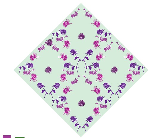
Those flowers look so great. In the smaller pattern, I love the framing, but I think the center of your frame needs another flower or two. That one lonely bud looks a bit too isolated. Though I don't see any connection between your first posted pattern and the other two, I think it's a really fun design!
FLOWEEEEEEEEEEERRRRRRRRRSSSSSSS. The colors takes away from all the details you put in. But the pattern is pretty sweet. I think if all fo the flowers were blown up, people would appreciate the detail much more. But nice color scheme. It blends well.
I like the really crazy burst of flowers there is alot of them but they are very well spaced and they have a cool color scheme. Not really sure what the theme is except maybe valentines day or a party?
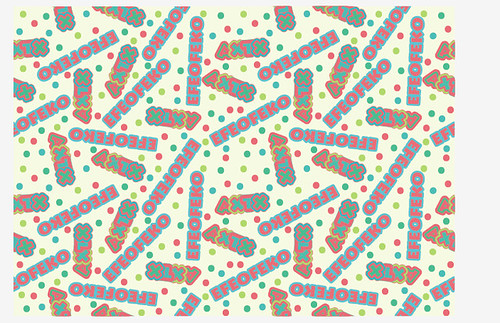
I like both of the top two patterns so much. I know you did the one top one in class - which I told you it looks like candy packaging or something! I love the dots as a pattern in the background. it looks lively. I also think you did a great job on the tossed flower pattern. your icons are wonderful and your spacing is very good. It looks like a perfect field of texture. I think you've done a good job with the color balance in both as well.
In the top one, I see one hole right in the middle. Can you move the word that says axtx over to cover it up? Then it would be perfect! The rest of the pattern looks great!
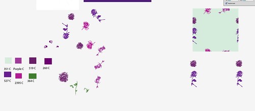
The damask is a nice start! I think it would be cool to see how you could do this one without turning the canvas - if you'd like, i can show you how to do that! The other thing I think you could do is try to make the coordinate seem a little differnet - it seems that the damask is your coordinate, right? maybe changing the color balance would help it feel like it's more different than the other blue flower pattern. I think you could also do it at a large scale, or overlap some of the flowers - which would help to make it seem a little different, too. Great job on these, they look great. I see you have your pantones, but it is hard to read them because they're so small!

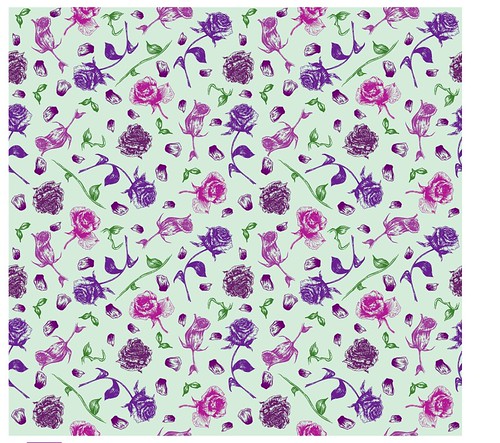
This pattern is balanced very well. The flowers look nice and unique. Great work.
ReplyDeleteI love the color pallet and I think you have a great sense for placement with these shapes, but it's hard to tell which is the main pattern and which is the complimentary! Also, the patterns don't seem to go together very well. But I enjoy the independently!
ReplyDeleteThose flowers look so great. In the smaller pattern, I love the framing, but I think the center of your frame needs another flower or two. That one lonely bud looks a bit too isolated. Though I don't see any connection between your first posted pattern and the other two, I think it's a really fun design!
ReplyDeleteFLOWEEEEEEEEEEERRRRRRRRRSSSSSSS. The colors takes away from all the details you put in. But the pattern is pretty sweet. I think if all fo the flowers were blown up, people would appreciate the detail much more. But nice color scheme. It blends well.
ReplyDeleteI like the really crazy burst of flowers there is alot of them but they are very well spaced and they have a cool color scheme. Not really sure what the theme is except maybe valentines day or a party?
ReplyDeleteGreat job on making the damask it looks awesome.
I like both of the top two patterns so much. I know you did the one top one in class - which I told you it looks like candy packaging or something! I love the dots as a pattern in the background. it looks lively. I also think you did a great job on the tossed flower pattern. your icons are wonderful and your spacing is very good. It looks like a perfect field of texture. I think you've done a good job with the color balance in both as well.
ReplyDeleteIn the top one, I see one hole right in the middle. Can you move the word that says axtx over to cover it up? Then it would be perfect! The rest of the pattern looks great!
The damask is a nice start! I think it would be cool to see how you could do this one without turning the canvas - if you'd like, i can show you how to do that!
The other thing I think you could do is try to make the coordinate seem a little differnet - it seems that the damask is your coordinate, right? maybe changing the color balance would help it feel like it's more different than the other blue flower pattern. I think you could also do it at a large scale, or overlap some of the flowers - which would help to make it seem a little different, too. Great job on these, they look great.
I see you have your pantones, but it is hard to read them because they're so small!