Had alot of fun with the bright colors and the outer glows. It became a little out of control in the end but I still had fun with this. I used glow effects and little bit of the gradient mesh.
Wow, I really enjoy this! I love the colors you chose, but I think that the bright blues and reds could be emanating even more light! Also, I am a little confused about the space, but I think throwing in more blue highlights on the figure and ground that he is on in reaction to the bright blue could help that!
The character design, the environment, the colors, the lighting, everything really seems to come together really well. I'm not quite sure what I'm looking at as far as the far-away blue shapes, but I'm not sure I need to for it to be a successful background. Maybe it'd be fun to see those blue shapes glowing like the thinner blue structure to the left? Though I'm not sure if you were intending it as a lighting source or not. The red highlight on the underside of the pants works well for me- though I think it also might make it look like the light is closer than where you have it now? All in all, really great work.
Looks good! I think the bright blue/green in the background would look nice with a subtle gradient over it. It may help add to the depth and space, which I think would help the character stand out more. Nice shapes and detail. It'd be nice to see more blue light reflected on the character too.
You're always really good at making sweet backgrounds, a skill I hope someday to have. I would have to agree tho that the brightness of the color on the background does take away from the glow effect a bit on the character. Playing around with the background brightness or mass might make your glowing effect on the character stronger.
i really love your style in this piece. and i like how you had hints of the outer glow effect throughout your piece. the character is so fun and i like the shapes you created as well. i love the color choices! really awesome job! one of my favorites!
Love the way you're creating space in this. all of your shapes are really nice and reminiscent of the shapes throughout the whole piece. it's got a real unity to it. even the way that youre treating the shadows on the character look like they really fit with the rest. Illustrator is looking good! I think you could bump up the glow color a little bit -- mabye instead of white glows, you could make them glow red -- or blue... it seems like the feel like the light coming off of them is a little different than the lights themselves- -- like the blue lights in his helmet / pack, could be a teal color, and the red light at the bottom could be casting up on the edges of his arm (the back of his arm) and the edge of his thigh / calf.. know what I mean? This has a lot of awesome potential for back-lighting as well coming from that large blue thing that kind of looks like a window or a glowing piece of machinery. I could see you adding a little touch of blue light around the right side of his body -- nice job.Really subtle use of gradients here - push them a little, but over the style is awesome.

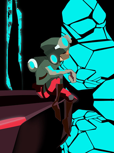
While the composition is nice, the blue on the right hand side is a little strong. It needs something to balance it out.
ReplyDeleteWow, I really enjoy this! I love the colors you chose, but I think that the bright blues and reds could be emanating even more light! Also, I am a little confused about the space, but I think throwing in more blue highlights on the figure and ground that he is on in reaction to the bright blue could help that!
ReplyDeleteIt is so cool! The color choice is really cool, I like the way you put red and green together on one page.
ReplyDeleteThe character design, the environment, the colors, the lighting, everything really seems to come together really well. I'm not quite sure what I'm looking at as far as the far-away blue shapes, but I'm not sure I need to for it to be a successful background. Maybe it'd be fun to see those blue shapes glowing like the thinner blue structure to the left? Though I'm not sure if you were intending it as a lighting source or not. The red highlight on the underside of the pants works well for me- though I think it also might make it look like the light is closer than where you have it now? All in all, really great work.
ReplyDeleteLooks good! I think the bright blue/green in the background would look nice with a subtle gradient over it. It may help add to the depth and space, which I think would help the character stand out more.
ReplyDeleteNice shapes and detail. It'd be nice to see more blue light reflected on the character too.
Gosh! The color on this is really cool! I love that orange shape you made for the nose! The forms are really well done too! GOOD JOB!
ReplyDeleteYou're always really good at making sweet backgrounds, a skill I hope someday to have. I would have to agree tho that the brightness of the color on the background does take away from the glow effect a bit on the character. Playing around with the background brightness or mass might make your glowing effect on the character stronger.
ReplyDeleteThings are so neon, but not so glowy. Amp up the outer glow just a bit and it will be very intense, just like neon
ReplyDeletei really love your style in this piece. and i like how you had hints of the outer glow effect throughout your piece. the character is so fun and i like the shapes you created as well. i love the color choices! really awesome job! one of my favorites!
ReplyDeleteLove the way you're creating space in this. all of your shapes are really nice and reminiscent of the shapes throughout the whole piece. it's got a real unity to it. even the way that youre treating the shadows on the character look like they really fit with the rest. Illustrator is looking good!
ReplyDeleteI think you could bump up the glow color a little bit -- mabye instead of white glows, you could make them glow red -- or blue... it seems like the feel like the light coming off of them is a little different than the lights themselves- -- like the blue lights in his helmet / pack, could be a teal color,
and the red light at the bottom could be casting up on the edges of his arm (the back of his arm) and the edge of his thigh / calf.. know what I mean? This has a lot of awesome potential for back-lighting as well coming from that large blue thing that kind of looks like a window or a glowing piece of machinery. I could see you adding a little touch of blue light around the right side of his body -- nice job.Really subtle use of gradients here - push them a little, but over the style is awesome.