
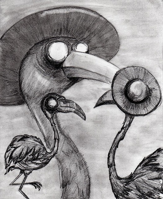
The original image
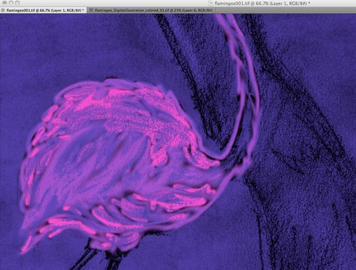
I tried using the tool to color the lines but I didn't like the way it was looking.
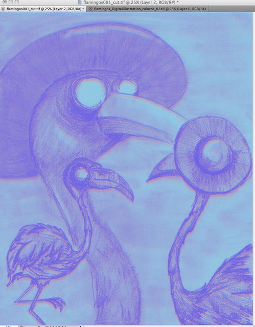
So I started over and used the fill tool on the lines. Then I copied the layer, changed the color, and moved it over a little. Creating this new effect. I later colored the hat in and put some accent colors on the largest flamingo.
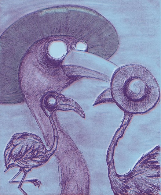
this is my final image
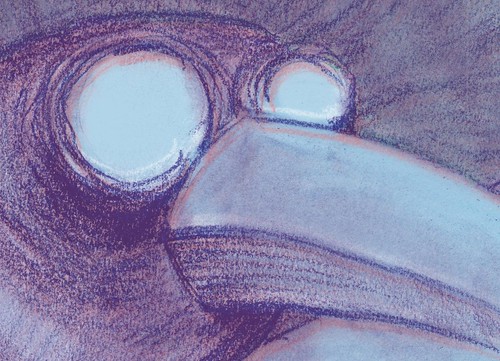
and a close up on the line work
I enjoy your initial sketch for this a lot! I think what you have done to it is a good start, but it could be pushed farther! Right now it just looks like a tinted sketch.
ReplyDeleteI think you're really getting a nice screen-printed look with the flat linework - since you kept everything simple, i get that feeling from your final! I think it would be really cool to see what would happen if you were really daring with color - maybe if you were to color in some of the beak /mask thing - eyes or whatever with some tonal purples that are darker than the tone of the background paper. Then, you'd be able to push them away from the tone of the background even further. I like how you're addin a little bit of white and pink into elements of your birds, too - it could be cool for you to do one more small layer on the top where you add a tiny, white (or light) layer of pencil marks, that you would color to stand out where you thought that certain elements should show more? Like maybe there is a white pencil-drawing shine on the beak that helps turn it in space .. or maybe there's a haze on the eyes so they look really glassy! Know what I mean?
ReplyDeleteI really like that you kept the initial texture in your sketch for this piece, I think it adds a nice creepy feel to the piece. I really like the very subtle color you put into this. It might've been fun to add just a hint of highlights/shadows to help give a better sense of a light source, adding to the highlight on the brim of the hat and the cheek for the large, central bird?
ReplyDeletehahahahah, so nice,really like your color choice and how you deal with your background.maybe you can get a little more details, like the eyes?
ReplyDeleteThe texture in your drawing looks really nice, and I like the purple you used in your linework. I think you could color your work a bit, or maybe add some variations of color in your linework. Giving your birds some atmosphere would be really beneficial too.
ReplyDelete