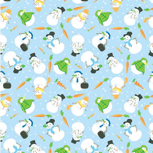
I ended up actually making two large patterns and one small one. I still need to reformat this to match the pattern presentation Lindsay showed us earlier, which I will do soon!
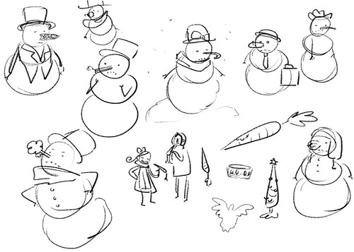
I think these look great, Maya! I really like the colors you used and the subject is very familiar but still fun and new. I'd buy the Snowman one for sure if it was on something :D.
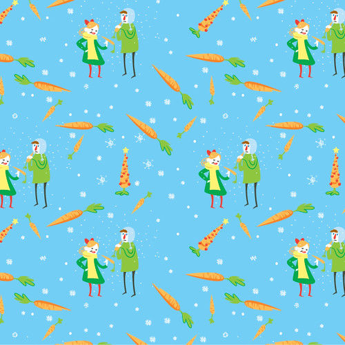
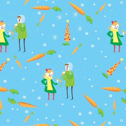
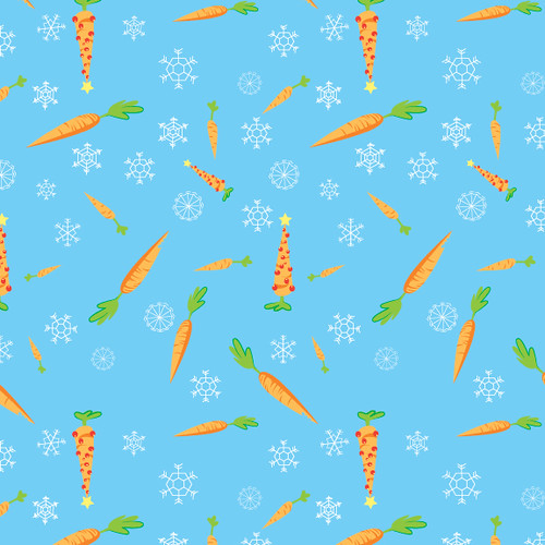
I think the spacing on the top one works well. I'm not quite sold on the one with the couple with the carrots, since it's pretty easy to see how it repeats and the carrots seem a bit clustered around each other the way they frame the pair.
I think the snowmen along with the purely-carrot pattern work best together.
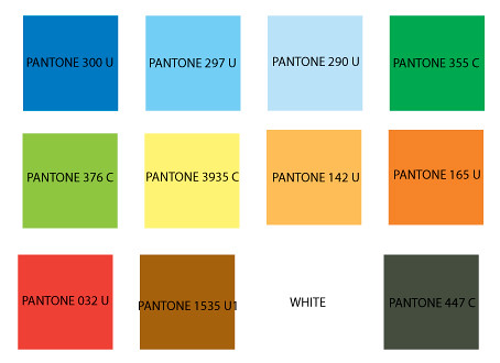
I agree with the comment above. The snowman and carrot one works best for your main pattern. I also really like the color palette you used. The colors really pop!
I think the spacing and placement of your icons is really great. The illustrations are very cute as well. The first pattern has a great sense of balance. The carrots would be a perfect corresponding pattern.
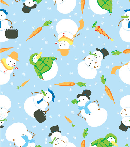
I like both the patterns. They are super sweet and well balanced. I also like the color choice. Im not sure which is the main and which is the corresponding so you may want to take another look at that.
These are hilarious. I am so happy you did a twist on one of the best pattern subjects for your portfolio! I think this will be a great one for you to show to potential clients if you decide to do more patterns! It's super funny and your characters have such life / personalities to them! I loe the way you've tossed the snowman one, your spacing looks great- and the way you're using color is really good. The only things I'd switch around is to see if you can add some black into the space where it seems like there is none? Maybe theres' a way to do that so it doesnt' look like a blank spot? I think if you changed the one orange hat to black it might help it! The other thing is, maybe take out the tree carrot since it only shows up once and you can see where it repeats in the 4 squares. and just put a regular carrot. That's about it! I think it's great! You've got an awesome handle on Illustrator - it looks really natural to you. Nice organic shapes!
Same with the pattern of the people eating carrots. It's a really funny other part of the story. This one has really nice spacing. it feels really even as well. I think it would be worth doing a snowflake only pattern as a basic coordinate - with the dark blue bkgrd color, or maybe white with blue flakes. That way your coordinates will have a nice contrast. I could see you doing white flakes on red, too. maybe show multiples in your portfolio. And yes, you should show this in the same layout! it would be great to see how your presentation would look! Great job!

I think these look great, Maya! I really like the colors you used and the subject is very familiar but still fun and new. I'd buy the Snowman one for sure if it was on something :D.
ReplyDeleteI think the spacing on the top one works well. I'm not quite sold on the one with the couple with the carrots, since it's pretty easy to see how it repeats and the carrots seem a bit clustered around each other the way they frame the pair.
I think the snowmen along with the purely-carrot pattern work best together.
I agree with the comment above. The snowman and carrot one works best for your main pattern. I also really like the color palette you used. The colors really pop!
ReplyDeleteI think the spacing and placement of your icons is really great. The illustrations are very cute as well. The first pattern has a great sense of balance. The carrots would be a perfect corresponding pattern.
ReplyDeleteI like both the patterns. They are super sweet and well balanced. I also like the color choice. Im not sure which is the main and which is the corresponding so you may want to take another look at that.
ReplyDeleteI can totally see winter though!
These are hilarious. I am so happy you did a twist on one of the best pattern subjects for your portfolio! I think this will be a great one for you to show to potential clients if you decide to do more patterns! It's super funny and your characters have such life / personalities to them! I loe the way you've tossed the snowman one, your spacing looks great- and the way you're using color is really good. The only things I'd switch around is to see if you can add some black into the space where it seems like there is none? Maybe theres' a way to do that so it doesnt' look like a blank spot? I think if you changed the one orange hat to black it might help it! The other thing is, maybe take out the tree carrot since it only shows up once and you can see where it repeats in the 4 squares. and just put a regular carrot. That's about it! I think it's great! You've got an awesome handle on Illustrator - it looks really natural to you. Nice organic shapes!
ReplyDeleteSame with the pattern of the people eating carrots. It's a really funny other part of the story. This one has really nice spacing. it feels really even as well. I think it would be worth doing a snowflake only pattern as a basic coordinate - with the dark blue bkgrd color, or maybe white with blue flakes. That way your coordinates will have a nice contrast. I could see you doing white flakes on red, too. maybe show multiples in your portfolio. And yes, you should show this in the same layout! it would be great to see how your presentation would look! Great job!