This is way awesome! The color, texture, composition - it all works super well!I think the bones get a bit blown out and the lack of texture from the photoshop brush shows there. They attract a bit too much attention to themselves, which makes it hard to look at the rest of the image! But otherwise, this is really great!
I like how you ended up pushing the color pallet, the brighter tones in the hair help balance the piece. I also like the contrast between the splotchy skin on the body and the soft hair.
I think you did a great job in your lighting, also the way you rendered the background really helps push the macabre feel. I think the collarbone and shadows in the neck can be pushed a bit more to make the head and torso connect a bit more smoothly. I also think that your awesome drippy blood could use a teeny bit of highlight to match the light source.
I really like the drawing a lot! THE FIGURE IS SO LUMPY IN SUCH AN AWESOME WAY! kudos on the gloopy blood! I do wish that there was more of a consent lighting situation and the lightest parts seem strange. I think you might have gone to white too quickly though :P
The character and background fits together flawlessly. The composition seems to work and it scares the hell out of me (so i like it . . . a lot). Not sure what i would do to change it or improve it. How did you get such vibrant colors?
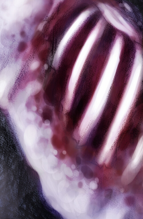
You definitely got the mood of the plague! I think the way you're working with the line drawing is really neat - i like where you can see the texture of your drawing showing through in the head and hair -- its a really nice textural part of the drawing. particularly in the hair that is in the bkgrd. I think the way you're adding color is also really nice. The way that the figure has a little bit of "life" to it -- with the more saturated tones -- is really nice and helps to get her up off the background. I know we talked a little about how you could frame this with a dark area -- I think where you started to do that on the side near her ribs looks really nice - I could see you pushing it even further. It seems like the only other thing you could add is some additional singular mini-highligths in her hair - maybe something that could give the top of her head the same kind of roundness as the body -(which looks awesome) I could also see some of the bloody mess having a bit of a shine - sparkle to it. maybe just in a couple places around the edges maybe? Since there is light coming from behind? iLove the closeup of your pencil drawing on the ribs- nice work.

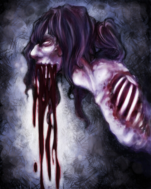
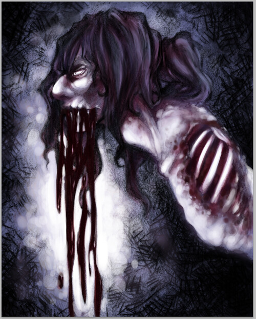
The colors and linework are fantastic! I'd like to see a little bit more of a background.
ReplyDeleteThis is way awesome! The color, texture, composition - it all works super well!I think the bones get a bit blown out and the lack of texture from the photoshop brush shows there. They attract a bit too much attention to themselves, which makes it hard to look at the rest of the image! But otherwise, this is really great!
ReplyDeleteI like how you ended up pushing the color pallet, the brighter tones in the hair help balance the piece. I also like the contrast between the splotchy skin on the body and the soft hair.
ReplyDeleteI think you did a great job in your lighting, also the way you rendered the background really helps push the macabre feel. I think the collarbone and shadows in the neck can be pushed a bit more to make the head and torso connect a bit more smoothly. I also think that your awesome drippy blood could use a teeny bit of highlight to match the light source.
ReplyDeleteI really like the drawing a lot! THE FIGURE IS SO LUMPY IN SUCH AN AWESOME WAY! kudos on the gloopy blood! I do wish that there was more of a consent lighting situation and the lightest parts seem strange. I think you might have gone to white too quickly though :P
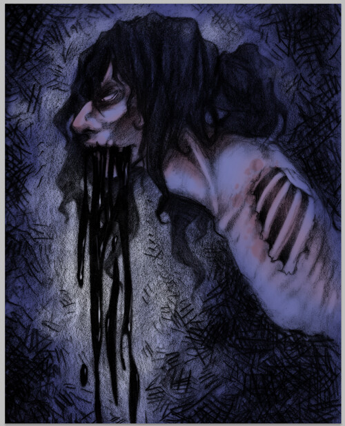
ReplyDeletevery cool, I like how it looks like it's crossing the line into the supernatural. Linework works very well. The composition works great, keep it up!
ReplyDeleteThe character and background fits together flawlessly. The composition seems to work and it scares the hell out of me (so i like it . . . a lot). Not sure what i would do to change it or improve it. How did you get such vibrant colors?
ReplyDeleteYou definitely got the mood of the plague! I think the way you're working with the line drawing is really neat - i like where you can see the texture of your drawing showing through in the head and hair -- its a really nice textural part of the drawing. particularly in the hair that is in the bkgrd. I think the way you're adding color is also really nice. The way that the figure has a little bit of "life" to it -- with the more saturated tones -- is really nice and helps to get her up off the background. I know we talked a little about how you could frame this with a dark area -- I think where you started to do that on the side near her ribs looks really nice - I could see you pushing it even further. It seems like the only other thing you could add is some additional singular mini-highligths in her hair - maybe something that could give the top of her head the same kind of roundness as the body -(which looks awesome) I could also see some of the bloody mess having a bit of a shine - sparkle to it. maybe just in a couple places around the edges maybe? Since there is light coming from behind? iLove the closeup of your pencil drawing on the ribs- nice work.
ReplyDelete