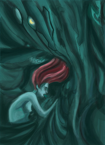
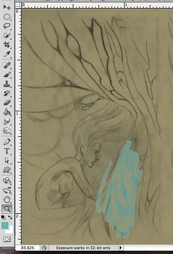
Oh man, I wish that you kept some more of the line work in this piece. The original sketch has so much life to it!Sharpening up some foreground areas might be helpful in bringing back some life Also switch up your values!
The color choices work really well, especially for this flowing theme.The composition is very interesting, it's like she is in the water,...but not, or maybe she is. All I know is there is a lot going on here and maybe the only thing I would like to see is a little bit more linework to establish clarity.
I think your intention and color pallet for this were really great! I think you could integrate transition from hair to barky tree thing a bit more - so it's not to sudden - and that would help, and maybe also unify the shadows more? With like a more definite light source(s?) and equal shadows. Like the shadows on her don't feel strong enough compared to the shadows on the trees! I also agree with Zoya that I miss some of your original lines in the final form!
I really like this idea, the color of her skin is really great. I think a bit more color variation would help to add to depth and lighting. Using the burn and dodge tools would really help you, I feel like.
I like the flowy-ness of your lines. I wish I could see more of her hair sticking between the green stuff like she is stuck in it or intwined. I get the creepy plague aspect to the piece through the colors and the girl puking. I wish I could see more depth in the piece. Maybe you could make that yellow shine part glow more and light up the piece a little bit.
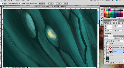
I like the way the arm begins to blend into the organic green forms. I think it would be cool if there were another instance or two of this blending, maybe in the lower torso, or hair? As for the organic, turqoise ground stuff... it looks pretty cool but I can't really tell what it is. Maybe that's okay, but I think it looks a little too monochromatic. Maybe you could add a bit more subtle coloring to back up the red and yellow anomalies.
This is super creepy - it's almost sci-fi like - or something. Like this green blob is sucking the life out of her??? I love your drawing and I wish it showed up just a little more in the final! I think it would be cool for you to see if you could overlay, or multiply it on top -- maybe just try to bring it back in some places in her figure so you can redefine the awesome drawing you did! I also think itcoule be cool for you to bring some red into a bit of the wall-thing! like - if it's reflecting a little bit of her hair color. i think it could be subtle, but I think it would help that environment feel like it's really wrapping around her- and that light is shared in the same space. The last thing I think could be cool is if you added one mroe layer of highlights on her - maybe coming from that yellow eye/light thing above her? maybe she's slimy? Maybe greasy? like - maybe there is some kind of slick texture on her from the wall that could be cool to play with. You know how wet things are always super contrasty? That's what I mean. Those highlights could also hit a couple of the areas on the wall if you wanted to play with it!

Oh man, I wish that you kept some more of the line work in this piece. The original sketch has so much life to it!Sharpening up some foreground areas might be helpful in bringing back some life Also switch up your values!
ReplyDeleteThe color choices work really well, especially for this flowing theme.The composition is very interesting, it's like she is in the water,...but not, or maybe she is. All I know is there is a lot going on here and maybe the only thing I would like to see is a little bit more linework to establish clarity.
ReplyDeleteI think your intention and color pallet for this were really great! I think you could integrate transition from hair to barky tree thing a bit more - so it's not to sudden - and that would help, and maybe also unify the shadows more? With like a more definite light source(s?) and equal shadows. Like the shadows on her don't feel strong enough compared to the shadows on the trees! I also agree with Zoya that I miss some of your original lines in the final form!
ReplyDeleteI really like this idea, the color of her skin is really great. I think a bit more color variation would help to add to depth and lighting. Using the burn and dodge tools would really help you, I feel like.
ReplyDeleteI like the flowy-ness of your lines. I wish I could see more of her hair sticking between the green stuff like she is stuck in it or intwined. I get the creepy plague aspect to the piece through the colors and the girl puking. I wish I could see more depth in the piece. Maybe you could make that yellow shine part glow more and light up the piece a little bit.
ReplyDeleteI like the way the arm begins to blend into the organic green forms. I think it would be cool if there were another instance or two of this blending, maybe in the lower torso, or hair? As for the organic, turqoise ground stuff... it looks pretty cool but I can't really tell what it is. Maybe that's okay, but I think it looks a little too monochromatic. Maybe you could add a bit more subtle coloring to back up the red and yellow anomalies.
ReplyDeleteThis is super creepy - it's almost sci-fi like - or something. Like this green blob is sucking the life out of her??? I love your drawing and I wish it showed up just a little more in the final! I think it would be cool for you to see if you could overlay, or multiply it on top -- maybe just try to bring it back in some places in her figure so you can redefine the awesome drawing you did! I also think itcoule be cool for you to bring some red into a bit of the wall-thing! like - if it's reflecting a little bit of her hair color. i think it could be subtle, but I think it would help that environment feel like it's really wrapping around her- and that light is shared in the same space. The last thing I think could be cool is if you added one mroe layer of highlights on her - maybe coming from that yellow eye/light thing above her? maybe she's slimy? Maybe greasy? like - maybe there is some kind of slick texture on her from the wall that could be cool to play with. You know how wet things are always super contrasty? That's what I mean. Those highlights could also hit a couple of the areas on the wall if you wanted to play with it!
ReplyDelete